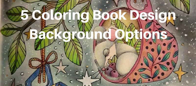
Coloring by @eugelauria
Do you ever complete a coloring design and wonder, “What now?”.
You have a beautifully colored design but there is a ton of white space around the design. This is when a lot of people can get some “colorist’s block”. Even though they have finished the design they don’t quite feel like it is complete and want to add something else, but don’t know what that is? Well creating a background is a wonderful option, and here are 5 different background options you should try out.
Create A Vignette Background
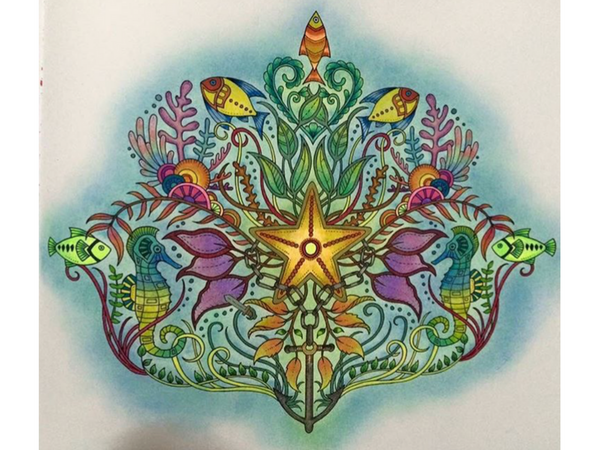
Coloring by @kulay_nikay
Vignette backgrounds are a wonderful solution for smaller designs that also feature some, or a lot of, complexity. Since these designs are smaller, they can have a lot of white space left over as a background which might be a bit too big of an undertaking. Also, since the design is probably centered it doesn’t really makes sense to color too much of the page. This is when vignette backgrounds are a wonderful option since they allow you to add that extra touch of color around the design without having to fill out the entirety of the blank page. Vignette backgrounds are also a great place to add some shading for an even better effect.
Create Shadows
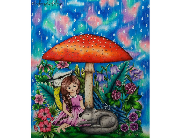
Coloring by @coloredwithlove_
A blank background provides you the ability to create an even more realistic looking coloring by adding shadows to your colorings. Many colorists will add shading to their work in order to transition their coloring from a 2D image to a more three dimensional scene with a large injection of realism. However to create a truly realistic coloring you need to take you coloring outside the lines and create shadows in the backgrounds. To do this, select a focal point and base all your shadows on that point. You will instantly see how much more professional your designs will look.
Watercolor Backgrounds
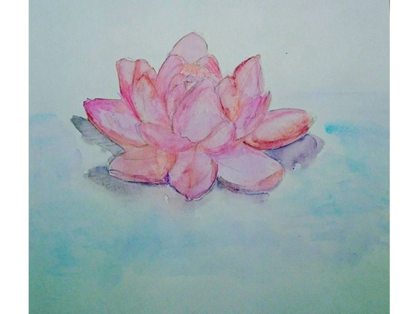
Art by @strawberry_min_art
Watercolor is a medium that lends itself wonderfully to backgrounds because of how seamlessly it blends together. Many other mediums like markers will create an “overlap shadow” where the color result is much darker where the first and second layer overlap. Since watercolors don’t dry as quickly they fuse together making a wonderful and solid background. One thing to keep in mind about using watercolors is to only do so on paper that can handle it, otherwise the paper will become soggy and wrinkled.
Don’t Add A Background
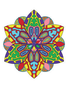
This may sound very simple and not exactly what you were looking for, but sometimes it is the best option. Backgrounds are great additions to designs which have complexity to them in the edges, but so much when there is a solid perimeter to the design... let me explain. A design like a mandala can have a lot of internal complexity, but around the perimeter, it is just a circle. Because of this, mandala don’t really lend themselves well to backgrounds. The same is true for many geometric designs. A simple design however, that does not have a uniform simple edge like a circle can, really benefit and lend itself well to a background. Sometimes less really is more.
Add Your Own Designs
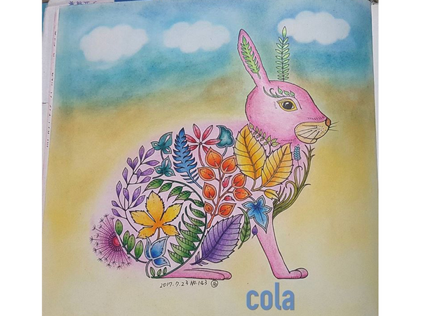
Coloring by @cola5437
Many colorists look at a sparse design negatively, like the blank space is a bad thing. And while it may not be the best feature, it isn’t necessarily completely void of possibilities. In fact, the blank space gives you the opportunity to add in your own designs to the page and make the piece of art truly your own.
Hope you liked these tips and as always - Happy Coloring

Comments
Kathy C Bradley on November 06 2017 at 01:50PM
Thanks for sharing.